INTRODUCTION:
--------------------------------------------------------------------------------
When building this theme, I focused on ease of use and a fast load time. Now,
you have the power to create unlimited UI design by using the W3CSS Paragraphs.
- Smaller and faster than other CSS frameworks.
- Easier to learn, and easier to use than other CSS frameworks.
- Uses standard CSS only (No jQuery or JavaScript library).
- Speeds up and simplifies web development.
- Supports modern responsive design (mobile first) by default.
- Provides CSS equality for all browsers. Chrome, Firefox, IE, Safari, and more.
- Provides CSS equality for all devices. PC, laptop, tablet, and mobile.
- Learn more about W3.CSS https://www.w3schools.com/w3css/
REQUIREMENTS:
--------------------------------------------------------------------------------
This theme does not require any moduels to be installed.
INSTALLATION:
--------------------------------------------------------------------------------
Download the theme to your-drupal-site-name/themes/ and go to
your-site-domain/admin/appearance and scroll to the bottom until you see W3CSS
Theme and click on Install and set as default and click save.
FEATURES:
--------------------------------------------------------------------------------
) W3CSS Theme is using the modern W3.CSS framework with built-in responsiveness
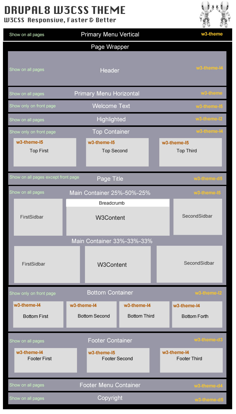
) W3CSS Theme has 22 regions. Check README.txt for more details.
) W3CSS Theme has 26 sections. In the theme settings under Advanced Site Colors
you have 26 fields for CSS customization.(Background Colors - Background Hover
Colors - Text Colors - Text Hover Colors - Link Text Colors - Link Text Hover
Colors - Link Background Colors - Button Colors - Button Hover Colors).
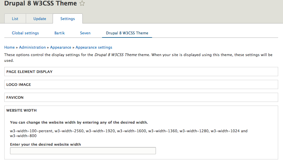
) W3CSS Theme comes with ability to change the website width. Just insert any
of the predefined classes into website width in theme settings.
(w3-width-100-percent, w3-width-2560, w3-width-1920, w3-width-1600,
w3-width-1360, w3-width-1280, w3-width-1024 and w3-width-800).
) W3CSS Theme comes with horizontal main menu or vertical side nav. Simply add
the main menu to the horizontal region or the vertical region.
) W3CSS Theme V2 comes with 101 fonts. 50 fonts can be applied to the global
site, 26 fonts for heading (H1, H2 and H3 and 25 special fonts can be applied
to any html tag. Any uploaded font has a CSS class can be applied to any html
tag.
) W3CSS Theme V2 comes with 24 CSS text animation effects. can be applied to
site name, page title or use the css class to apply it to any html tag.
) W3CSS Theme V2 comes with a custom page layout for user login/register/reset
password.
) W3CSS Theme V2 comes with a custom border animation for top regions, bottom
regions and footer regions..
) W3CSS Theme comes with over 50 predefined color themes. Simply insert the
name of any of the predefined themes. More will be added.
) W3CSS Theme comes with the ability to create your own private W3.CSS theme
and apply it to your site.
) W3CSS Theme V1 comes with 6 color libraries. (US Highway, US Safety,
Camouflage, Vivid, European Signal and Food).
) W3CSS Theme V2 comes with 11 color libraries. (Camouflage, European Signal,
Fashion, Flat UI, Food, IOS, Metro UI, US highway, US Safety, Vivid and Win8).
You can create unlimited color themes.
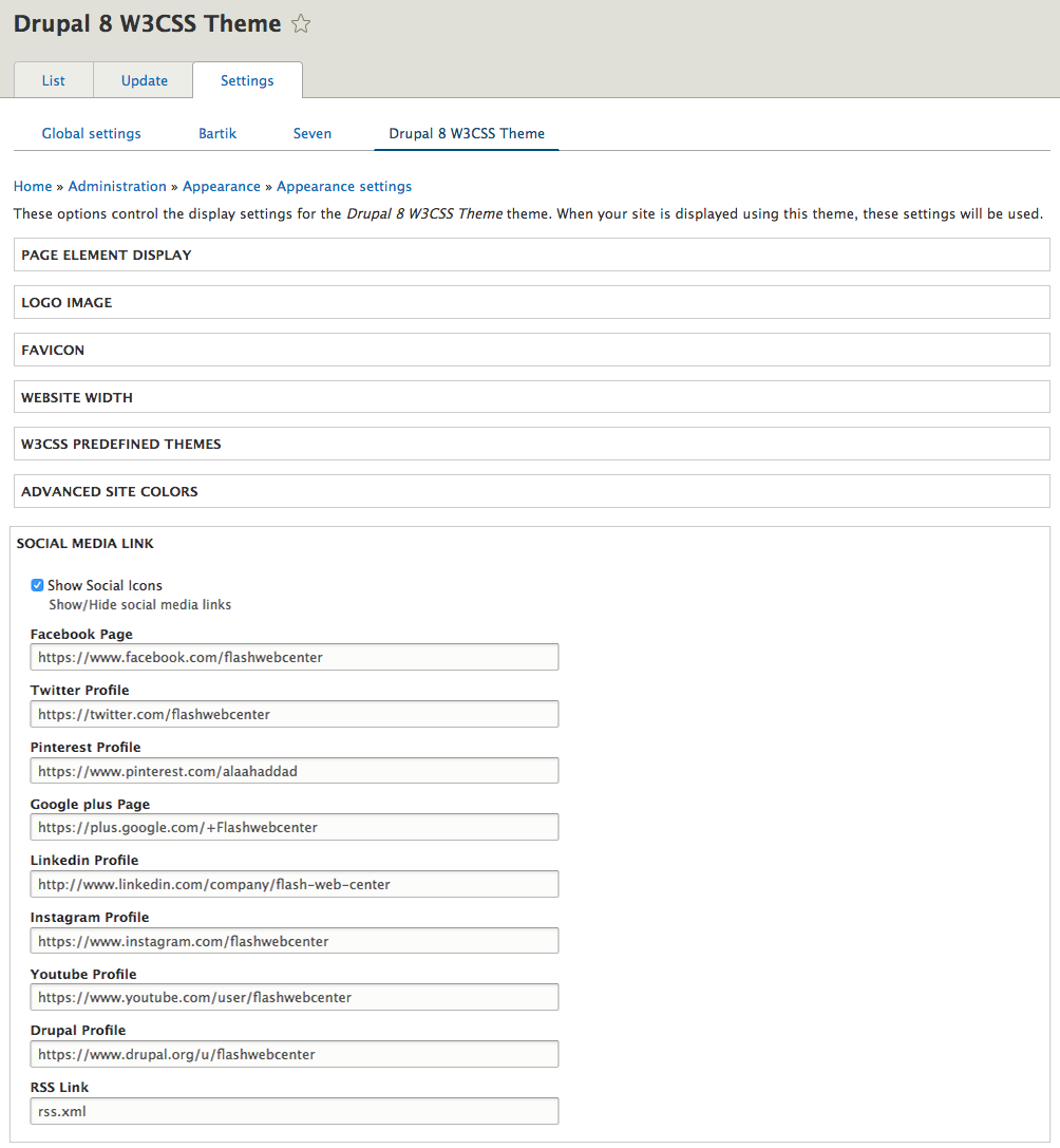
) W3CSS Theme comes with 8 social media links that are easy to configure.
) W3CSS Theme has a top region that includes three flexible regions. (The total
space in the top region will be divided by the number of regions you filled.)
) W3CSS Theme has a bottom region that includes four flexible regions. (The
total space in the bottom region will be divided by the number of regions you
filled.)
) W3CSS Theme has a footer region that includes three flexible regions. (The
total space in the footer region will be divided by the number of regions you
filled.)
) W3CSS Theme comes with Font Awesome 4.7.0, 5.15.4 or 6.1.1 optional you can
enable them in theme settings.
) W3CSS Theme comes with jQuery match height. Example: If you have three blocks
in the top area, they will always have matching height on the large screen
size. The script was removed and it uses CSS Flexbox.
) W3CSS Theme comes with a responsive main menu and It is three level
drop-down menu. The drop-down works on hover for big screen and on click for
small screen.
) W3CSS Theme will hide completely (divs, wrappers, classes) any region you
don't use. Nothing will be printed in the back.
) W3CSS Theme uses the minimum HTML structure to show the content. Example,
You will not see div > div > div > div > div.
) W3CSS Theme comes with the ability to create a custom page template according
to content type's name. If you have two content types article and video you can
have page--article.html.twig and page--video.html.twig
) W3CSS Theme comes with the ability to create a custom page template for any
view. Example if you have a view name "recent_video", then you can create a page
template name page--recent-video.html.twig.
) W3CSS Theme comes with the ability to create a custom page template for any
vocabulary. Example if you have a vocabulary name "Tags", then you can create a
page template name page--taxonomy--tags.html.twig.
) W3CSS Theme comes with the ability to change the main container's columns
layout to equal width. Change the columns from (25% 50% 25%) to (33% 33% 33%)
) W3CSS Theme comes with the ability to create a responsive horizontal three
level secondary menu or a responsive vertical three level secondary menu.
) W3CSS Theme comes with customized Sub-themes. Each sub-theme has different
layout/template.
CONFIGURATION:
--------------------------------------------------------------------------------
The new version was added with all new featuers. If you are using V1 and you did
not override the page.html.twig, then you can update the theme however you
normally do. If you did override the page.html.twig, then you will need to
clone the new page.html.twig and update it.
You can build any website layout with the w3.css library. I try to add the most
well-known templates/layouts. I added some sub-themes to include different
layouts. If you see a w3css template that you want to have available in this
theme then let me know and I'll customize it and add it to the collection as a
sub-theme.
Note: All customized Sub-themes have an extra region in addition to the regions
in the parent theme for the sticky search block. If you click on the search
icon, you'll get a sticky search bar on the top in return.
What are drupal8 w3css Sub-themes? They are custom themes with different page
layouts.
What are drupal8 w3css predefined color themes? They are color skins that can
be applied to a W3CSS Theme or any of its sub-themes.
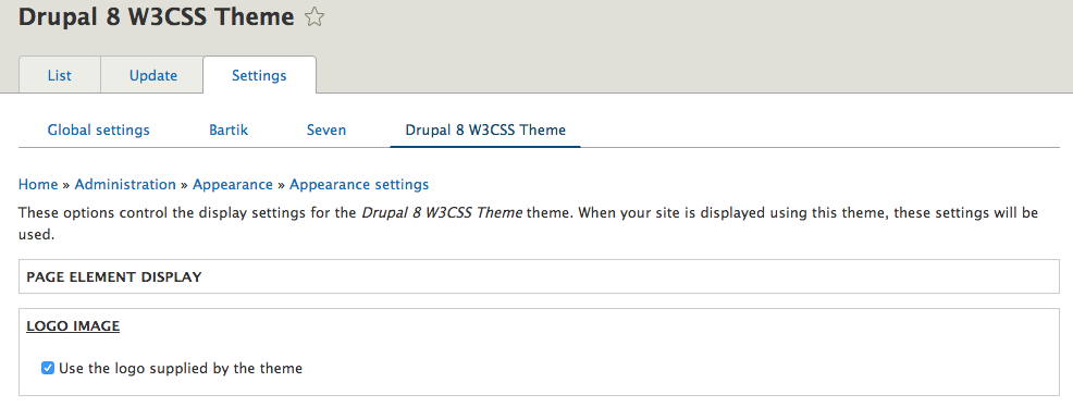
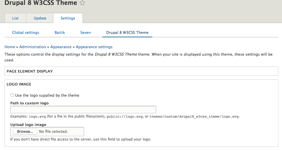
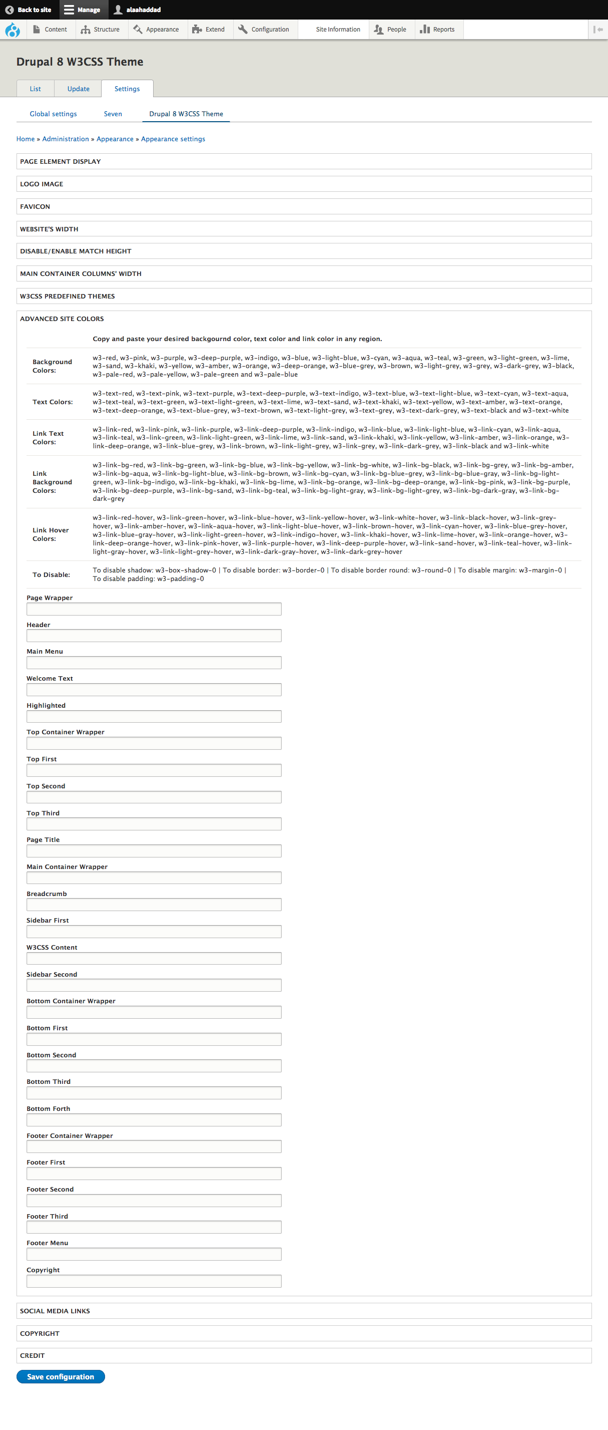
* How to change the logo
........................
Go to your-drupal-site-name/admin/appearance/settings/drupal8_w3css_theme and
uncheck “Use the logo supplied by the theme” then upload your own website logo
they insert the path in logo text "Path to custom logo" box and click save.
Logo size is fixed. If you want to change the logo's size you will have to
change it in the sub theme.
* How to enable the page title
..............................
Go to your-drupal-site-name/admin/structure/block and scroll down until you see
Page Title's region. Page Title block is disabled by default, just click on
Enable to enable the page title
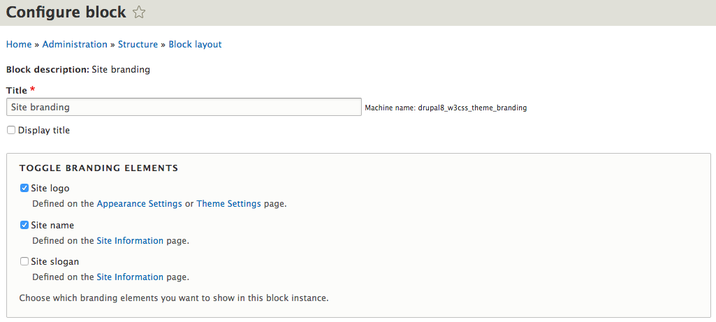
* How to enable the site slogan
...............................
Go to your-drupal-site-name/admin/structure/block and in header region. You
should see two blocks User account menu and Site branding. Click on configure
for Site branding and check the check box for Site Slogan.
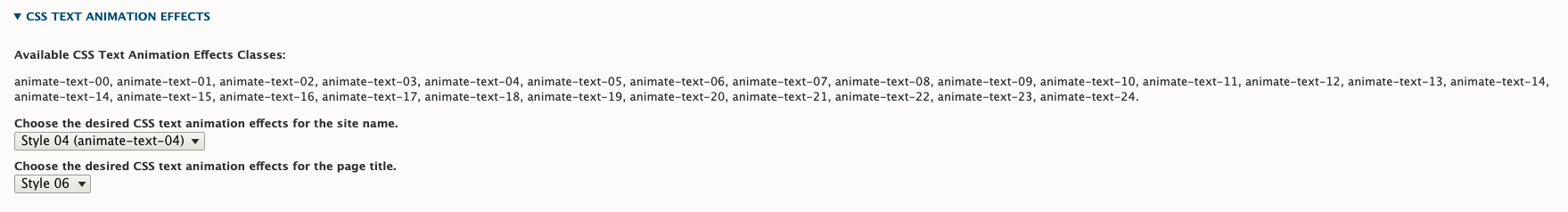
* CSS Text Animation Effects Classes | W3CSS Theme V2
...........................
Go to your-drupal-site-name/admin/appearance/settings/drupal8_w3css_theme and
click on CSS TEXT ANIMATION EFFECTS - W3CSS THEME to expand it. You can choose
the animation for the site name or page title. Also you will see the css text
animation effect classes that you can use with any html tag.
* How to enable/disable region border animation? | W3CSS Theme V2
...........................
Go to your-drupal-site-name/admin/appearance/settings/drupal8_w3css_theme and
click on ENABLE BORDER ANIMATION - W3CSS THEME to expand it. There is a
checkbox to enable/disable the border animation for top regions, bottom
regions and footer regions.
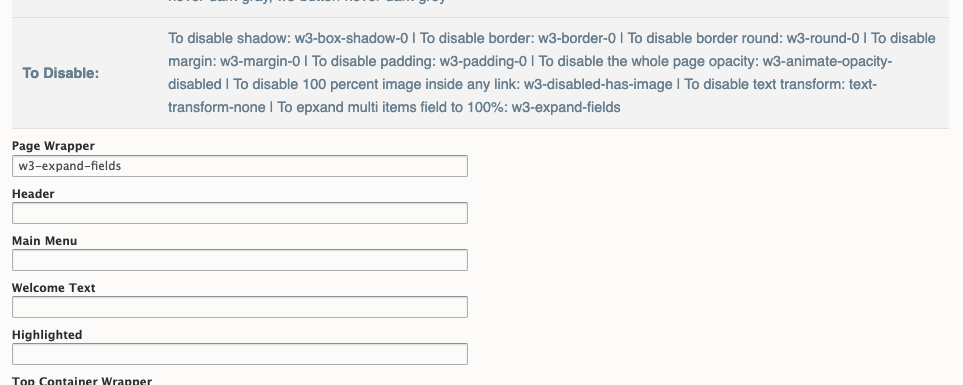
* How to expand multi items field to 100%? | W3CSS Theme V2
...........................
By default, any drupal field with multiple items (like taxonomy, file, user
etc. ) will display those items in one line. If you want to change that, go to
your-drupal-site-name/admin/appearance/settings/drupal8_w3css_theme and click
on ADVANCED SITE COLORS - W3CSS THEME to expand it then add w3-expand-fields
to Page Wrapper field.
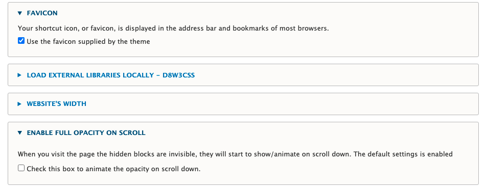
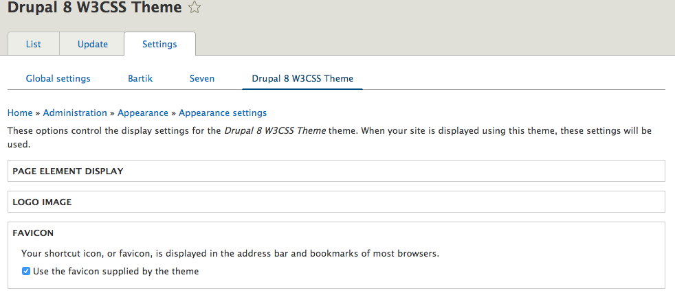
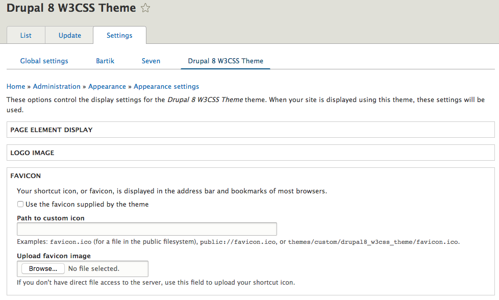
* How to change the favicon
...........................
Go to www.your-drupal-site-name/admin/appearance/settings/drupal8_w3css_theme
and uncheck “Use the favicon supplied by the theme” then upload your own favicon
and click save.
* How to change website width
.............................
In W3CSS Theme V2 was changed to a dropdown select list.
Go to your-drupal-site-name/admin/appearance/settings/drupal8_w3css_theme and
click on Website Width to expand it. Copy and paste your desired website width
and click save.
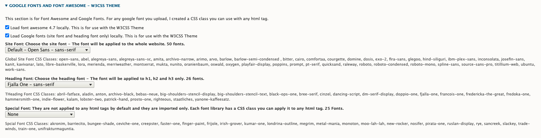
* How to change website font or heading font? | W3CSS Theme V2
.............................
Go to your-drupal-site-name/admin/appearance/settings/drupal8_w3css_theme and
click on GOOGLE FONTS - W3CSS THEME to expand it. You can
choose the site font or heading font.
Special font are not applied to any html tage by default. You just choose the
font then use the css class with any html tag.
Tip: Any font you choose for the site or heading will have a CSS class that
you can apply to any html tag.
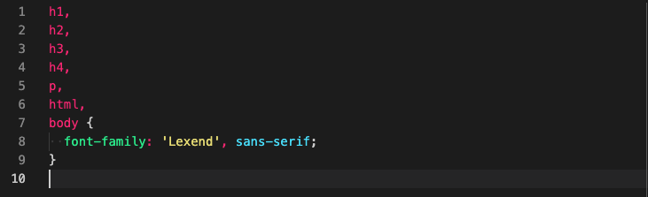
Example: If I have chosen the font "Anton" for the heading and I want to apply
this font to a paragraph, here is how it's done;
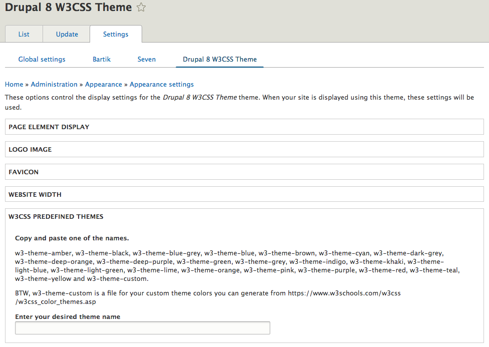
* How to use the w3css predefined themes
........................................
In W3CSS Theme V2 was changed to a dropdown select list.
Go to your-drupal-site-name/admin/appearance/settings/drupal8_w3css_theme and
click on w3css predefined color themes to expand it. Copy and paste any of
your desired w3css color theme and click save. FYI: if you have any w3
classes in Advanced Site Color Section they will not override the uploaded
color theme because of the CSS order. Any predefined theme file it will be
loaded after w3.css.
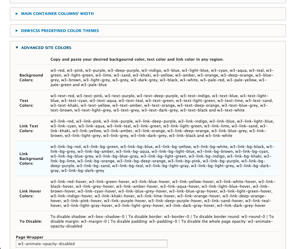
* How to change website colors
..............................
Go to your-drupal-site-name/admin/appearance/settings/drupal8_w3css_theme and
click on Advanced Site Colors to expand it. Each section in the website can
be modified and click save. You can change the text color, background color,
padding, margin or borders. You can use any of W3 CSS Classes
https://www.w3schools.com/w3css/w3css_references.asp
* How to change Social Media Links
..................................
Go to www.your-drupal-site-name/admin/appearance/settings/drupal8_w3css_theme
and click on Social Media Link to expand it. Change any of the links and click
save.
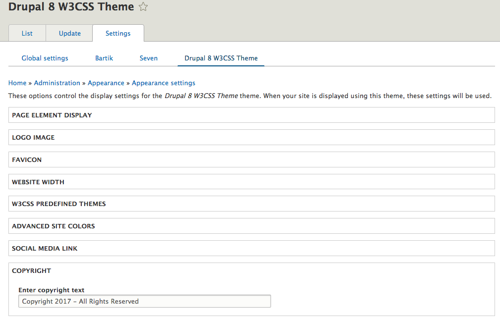
* How to change copyright
.........................
Go to www.your-drupal-site-name/admin/appearance/settings/drupal8_w3css_theme
and click on Copyright to expand it, then change the text there and click save.
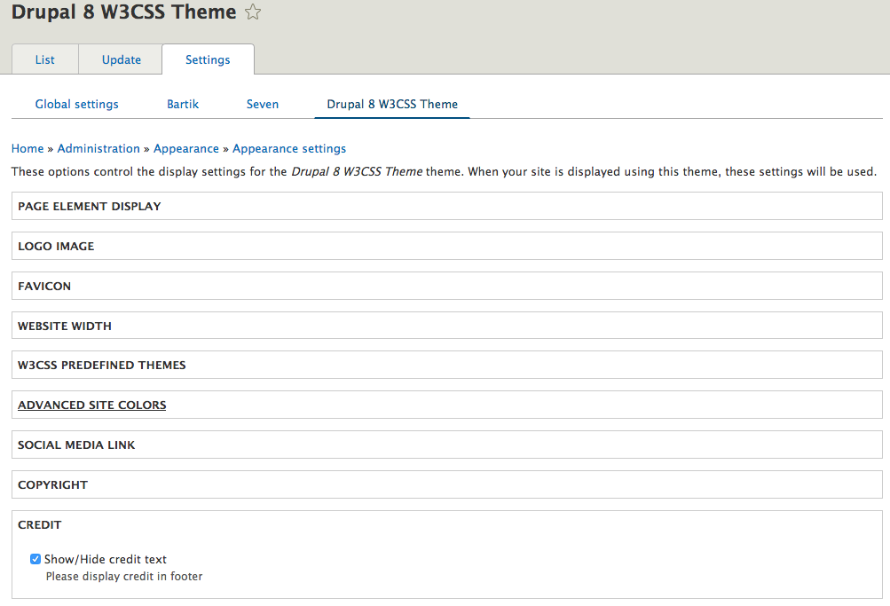
* How to disable the credit at the bottom
.........................................
Go to www.your-drupal-site-name/admin/appearance/settings/drupal8_w3css_theme
and click on Credit to expand it. Uncheck the Show/Hide Credit Text and click
save.
* How to disable the whole page opacity animation.
.........................................
Go to your-drupal-site-name/admin/appearance/settings/drupal8_w3css_theme and
click on ADVANCED SITE COLORS then insert into the text field Page Wrapper
w3-animate-opacity-disabled
* How to disable animate opacity on scroll down.
.........................................
Go to your-drupal-site-name/admin/appearance/settings/drupal8_w3css_theme and
click on ENABLE FULL OPACITY ON SCROLL then uncheck the checkbox next to Check
this box to animate the opacity on scroll down.
* How to create a new custom predefined color theme
...................................................
You must have a sub-theme to store the generated css.
Go to https://www.w3schools.com/w3css/w3css_color_generator.asp and create your
custom private theme. Follow the steps to generate a private theme.
Go to your-drupal-site-directory/themes/custom/your-sub-theme/css/styles.css
open and paste the generated css inside styles.css.
Clear caches and it is done.
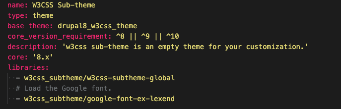
* How to use the drupal8_w3css_subtheme
.......................................
Inside the folder
your-drupal-site-directory/themes/drupal8_w3css_theme/drupal8_w3css_subtheme
you will have all the necessary files for start up sub-theme.
-- Steps for creating a new sub-theme for W3CSS Theme.
1) Copy the sub-theme from the W3CSS Theme and paste it in your custom theme
directory.
2) Re-name the copied folder to have the new sub-theme name. Example: my new
sub-theme is w3css_subtheme. I will rename the folder from
"drupal8_w3css_subtheme" to "w3css_subtheme".
3) Open the new named sub-theme folder "w3css_subtheme" and change the following
files' names from:
drupal8_w3css_subtheme.theme >> To >> w3css_subtheme.theme
drupal8_w3css_subtheme.info.yml >> To >> w3css_subtheme.info.yml
drupal8_w3css_subtheme.libraries.yml >> To >> w3css_subtheme.libraries.yml
4) Open the file w3css_subtheme.info.yml in your text editor and edit the
following:
line 1 from "Drupal8 W3CSS Subtheme" >> To "W3css Subtheme", This is human
readable name.
line 8 from "drupal8_w3css_subtheme/d8w3css-subtheme-global" >> To >>
"w3css_subtheme/d8w3css-subtheme-global".
We are only changing the drupal8_w3css_subtheme to the new sub theme name.
The name "d8w3css-subtheme-global" is the library name and MUST match the name
in w3css_subtheme.libraries.yml.
If you would like to change the library name you MUST change it in both files.
5) Make sure the spaces in this file are not changed. The sub-theme now is
ready to be enabled.
-- Steps for creating a new sub-theme of a sub-theme.
I will be using the sub-theme Amun as an example and you can follow these steps
with any of the sub-themes.
1) Copy the amun_subtheme from the Amun Sub-Theme and paste it in your custom
theme directory.
2) Re-name the copied folder to have the new sub-theme name. Example: my new
sub-theme is amun_custom_subtheme. I will rename the folder from
"amun_subtheme" to "amun_custom_subtheme".
3) Open the new named sub-theme folder "amun_custom_subtheme" and change the
following files' names from:
amun_subtheme.theme >> To >> amun_custom_subtheme.theme
amun_subtheme.info.yml >> To >> amun_custom_subtheme.info.yml
amun_subtheme.libraries.yml >> To >> amun_custom_subtheme.libraries.yml
4) Open the file amun_custom_subtheme.info.yml in your text editor and edit the
following:
line 1 from "Amun Sub-Theme" >> To "Amun Custom Sub-theme", This is human
readable name.
line 8 from "amun_subtheme/amun-subtheme-global" >> To >>
"amun_custom_subtheme/amun-subtheme-global".
5) Make sure the spaces in this file are not changed. The sub-theme now is
ready to be enabled.
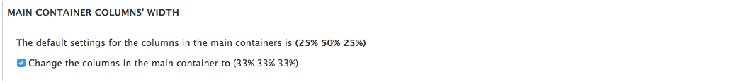
* How to Change The Main Container's Columns to Equal Width
...........................................................
Go to www.your-drupal-site-name/admin/appearance/settings/drupal8_w3css_theme
and click on Change The Main Container's Columns to Equal Width and insert
33-33-33 in the text box then click save.
* How to Create The Main Menu
.............................
(Drupal comes with a default main menu.)
1) You don't have to use the default main menu as your main menu. ANY menu can
be the main menu.
2) If you want a horizontal menu just drop ANY menu in the Primary Menu region.
3) If you want a horizontal menu just drop ANY menu in the Primary Menu
Vertical region.
4) You don't have to create any a special template for the vertical or
horizontal main menu. menu--main.html.twig
5) You can create two main menus and use the two regions.
http://drupal8-w3css-theme.flashwebcenter.com
6) Note: A vertical main menu is different from a side menu in your website.
(Example for the vertical menu:
https://www.w3schools.com/w3css/tryw3css_templates_interior_design.htm)
A side menu is just a secondary menu you have on your website. The secondary
menu can be vertical or horizontal and you can place it in left or right column.
* How to Create a Responsive Horizontal Secondary Menu
......................................................
Create a menu with any name. Example the new menu name is 'Titto'. Add all the
links as usual in drupal. The maximum number of menu levels to show is three.
This maximum number includes the initial level. Level one is always visible on
screen resolution bigger than 992px. The two levels show on hover. On screen
resolution less than 992px all levels are hidden and they show by clicking.
Go to d8w3css/templates/navigation and clone menu--responsive-h.html.twig to
your sub theme folder and name it menu--titto.html.twig. Clear all caches and
you are done.
* How to Create a Responsive Vertical Secondary Menu
....................................................
Create a menu with any name. Example the new menu name is 'Titto'.
Add all the links as usuall in drupal. The maximum number of menu levels to show
is three. This maximum number includes the initial level. Level one is always
visible. The two levels are hidden and you show them by clicking.
Go to d8w3css/templates/navigation and clone menu--responsive-v.html.twig to
your sub theme folder and name it menu--titto.html.twig. Clear all caches and
you are done.
* How to Make the Main Vertical Menu Open On The Right Side
....................................................
1- Create a sub-theme.
2- copy page .../d8w3css/templates/layout/page.html.twig to the sub-theme.
3- Open page.html.twig in the sub-theme and find the words "main-navigation-v".
On the same line, change "w3-animate-left" to "w3-animate-right".
4- Find the word "open-nav-inner". On the same line, change "w3-left"
to "w3-right".
5- Copy and paste the following css in the sub-theme css style file:
#main-navigation-v.w3-sidebar{right:0;}
#open-nav-inner {margin:0 0 0 10px!important;}
* How to remove background colors and use an image as a background.
....................................................
Create a sub-theme.
Go to d8w3css/css/w3-css-theme-custom and copy w3-theme-00029.css
file inside your-sub-theme/css folder.
Open your-sub-theme.libraries.yml and paste css/w3-theme-00029.css: {}
under css/styles.css: {}.
Note: Spacing must be aligned exactly underneath.
Create a folder inside the sub-theme and name it images. Add the image you
want to use as a background inside images folder.
The image name must be page-wrapper.jpg.
* How to use W3.CSS classes with views
....................................................
https://www.youtube.com/watch?v=wCObqmBn3Xk


